1. Introduction: Design is Not Art (It’s Visual Engineering)
The Hook – The 3-Second Rule
In the digital landscape of 2026, you do not have minutes to impress a user; you have milliseconds. Studies consistently show that users form an opinion about a website’s credibility within 0.05 seconds—effectively, the blink of an eye. Before a user reads a single word of your copy, your design has already communicated trust, competence, or chaos.
The Myth-Buster
There is a persistent misconception that graphic design is simply "making things look pretty." This is false. Design is visual engineering. It is the strategic arrangement of visual data to direct attention, reduce cognitive load, and force a specific action. While art asks questions, design answers them.
The 2026 Context
We are living in the age of generative AI. Tools can now instantly spit out thousands of layout variations. However, AI often mimics aesthetics without understanding psychology. To truly leverage these tools, a human designer must understand why a layout works. Only by mastering the fundamental principles can you ensure your designs are optimized for the human brain, not just an algorithm.
The Roadmap
To master visual communication, you must master the core principles. Here are the 7 pillars that hold up every successful composition:
- Emphasis: The focal point that grabs attention.
- Balance & Alignment: The stability that creates trust.
- Contrast: The difference that creates accessibility.
- Hierarchy: The map that guides the eye.
- Repetition: The rhythm that builds recognition.
- Proportion: The relationship between elements.
- White Space: The breathing room that clarifies the message.
2. Ingredients vs. The Recipe: Elements vs. Principles
It is common for beginners to confuse the elements of design with the principles of design. Think of it like baking a cake.
The Analogy
- The Ingredients (Elements): These are the raw materials—Color, Line, Shape, Texture, Typography, and Space.
- The Recipe (Principles): This is how you arrange those ingredients—Balance, Contrast, Emphasis, etc.
You can have the highest quality ingredients (a beautiful color palette and a modern font), but if you throw them into a bowl without a recipe (no hierarchy or balance), the result is a mess.
Why It Matters
When principles are ignored, the user experiences high "cognitive load." Their brain has to work too hard to figure out what is important. Good design principles reduce this mental effort. They make the complex feel simple and the chaotic feel organized.
To dig deeper into the foundations, read more about What are the 7 Main Principles of Design? to see how these fundamentals interact.
3. The Deep Dive: The 7 Principles of Modern Design
I. Emphasis: Creating the “Visual Hook”
Emphasis is about dominance. It tells the viewer, "Look here first." If every element on your page is screaming for attention—bold fonts, bright colors, flashing animations—the user hears nothing. This is known as "visual noise."
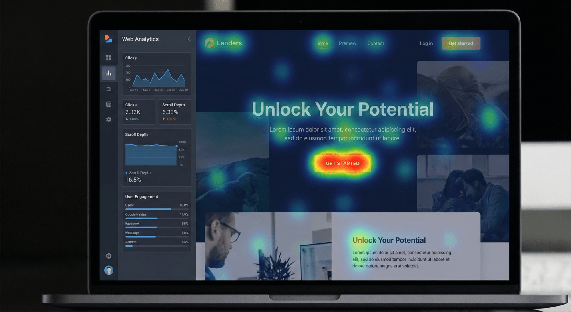
- 2026 Relevance: In modern UI, emphasis is crucial for conversion. Predictive eye-tracking tools and AI heatmaps now allow designers to scientifically test if their focal point (usually a Call to Action) is actually grabbing attention.
- Practical Tip (The Squint Test): Sit back and squint your eyes at your screen until the design blurs. What stands out? If it isn’t your primary message or CTA, your emphasis is wrong.
II. Balance & Alignment: Finding Visual Gravity
Balance provides stability and structure. It is the distribution of visual weight (colors, texture, and space) within a layout.
- Symmetrical Balance: Mirror image. Traditional, formal, and trustworthy.
- Asymmetrical Balance: Different elements with equal visual weight. Modern, dynamic, and interesting.
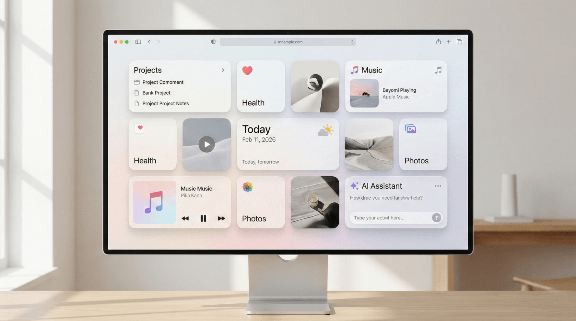
- The Modern Trend: The "Bento Grid" layout—popularized by Apple and widely adopted in 2026—is a masterclassName in modular balance and strict alignment grids.
- Psychology: Humans prefer equilibrium. Unbalanced designs feel precarious, causing subconscious anxiety or "cognitive friction."
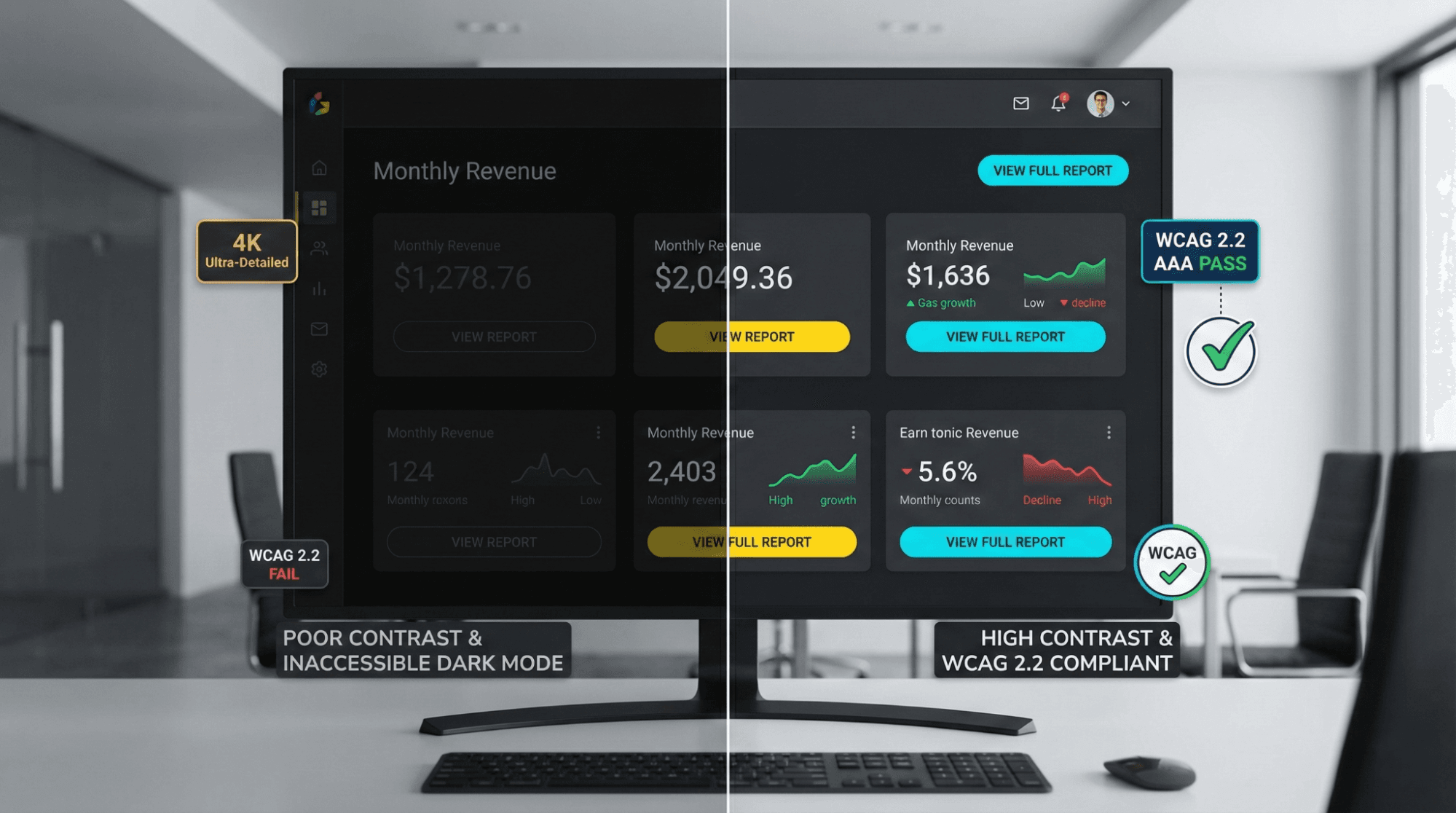
III. Contrast: The Secret to Accessibility (WCAG 2.2)
Contrast is the difference between two elements. It creates interest, but more importantly, it creates legibility. In 2026, contrast is no longer just an aesthetic choice; it is a compliance requirement.
- Accessibility Standards: Web Content Accessibility Guidelines (WCAG 2.2) require specific contrast ratios (e.g., 4.5:1 for normal text) to ensure content is readable for visually impaired users.
- The Dark Mode Challenge: High contrast does not mean "white on black." It requires nuance. In dark mode, pure black (#000000) can cause eye strain; dark greys with off-white text reduce halation and improve readability.
- Types of Contrast: Beyond color, use size contrast (big vs. small) and weight contrast (bold vs. light fonts).
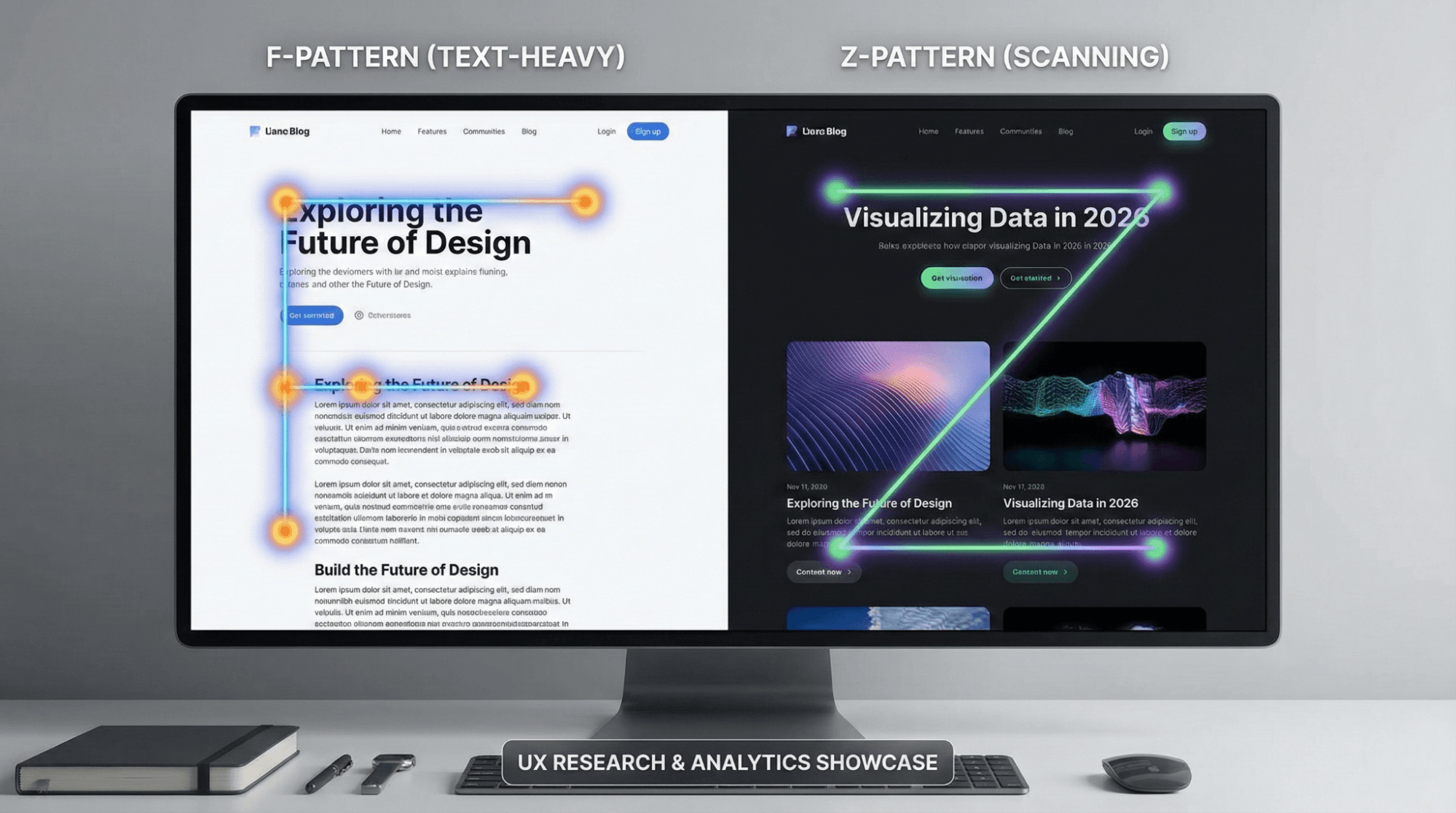
IV. Hierarchy: Building the User’s GPS
Visual hierarchy arranges elements in order of importance. It acts as a GPS, guiding the user's eye from the headline to the image, and finally to the body text.
- Scan Paths:
- F-Pattern: Used for text-heavy content like blogs. Users scan the top, then down, then across.
- Z-Pattern: Used for landing pages. The eye moves from the logo (top left) to the CTA (top right), diagonally down to the middle, and across to the final button.
- Typography: Use H1s for the main hook, H2s for sub-points, and body text for details. This structure helps search engines and humans alike.
For a broader look at how professionals structure their work, check out What Does a Designer Do? A Comprehensive Guide to Roles, Responsibilities, and Skills.
V. Repetition: The “Echo” of Brand Trust
Repetition unifies a design. By repeating specific styles (fonts, colors, shapes, or button styles), you create a cohesive visual language.
- Brand Consistency: If your homepage uses rounded buttons, your contact page shouldn't use square ones. This repetition builds a subconscious "rhythm" that users recognize as your brand voice.
- The Tech Angle: In 2026, repetition is managed through Design Systems and Component Libraries. This ensures that an app looks the same on a smartwatch as it does on a desktop 8K monitor.
- Warning: Repetition creates unity, but too much repetition creates visual fatigue. Break the rhythm occasionally to maintain interest.
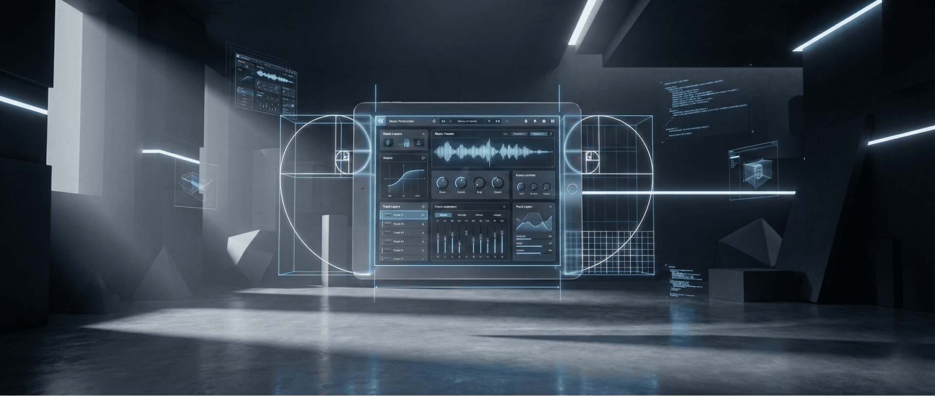
VI. Proportion: The Golden Ratio in a Mobile World
Proportion is the relationship of sizes between different elements. It dictates how the headline relates to the image, or the button to the background.
- Modern Shift: In a mobile-first world, proportion is governed by the "Thumb Zone." Interactive elements must be proportioned large enough to be tapped easily.
- 2026 Trend: Oversized Typography. We are seeing a trend of massive, screen-filling text paired with tiny, utilitarian details. This dramatic play on scale creates an immediate modern feel.
Understanding proportion is also vital in other visual fields. See our Photography Composition Guide: Tips to Improve Your Photos to see how proportion applies through the lens.
VII. White Space: The Art of Breathing Room
White space (or negative space) is the area between elements. It is not "empty" space; it is an active design element.
- Clarity: White space prevents information overload. It allows the user's eye to rest and breathe.
- Luxury Psychology: Observe high-end brands (like luxury fashion or tech). They use generous white space. Clutter is often associated with "cheap" or "discount." Space is associated with value.
- Mobile Utility: On touchscreens, white space is a functional necessity to prevent "fat-finger" errors—clicking the wrong link because elements are packed too tightly.
4. The 2026 Edge: Design in the Age of AI & Neuro-Inclusion
The principles of design are timeless, but their application evolves.
AI as the Intern
Tools like Canva, Adobe Firefly, and Figma AI are powerful, but they are "interns." They can generate options, but they lack the nuance of human empathy. A designer uses the 7 principles to curate and refine AI output, ensuring it meets strategic goals rather than just aesthetic ones.
Neuro-Inclusivity
Modern design is increasingly focusing on neurodiversity.
- ADHD: Designs utilize clear hierarchy and "chunking" of information to prevent overwhelm.
- Dyslexia: Weighted bottoms on fonts and generous leading (line spacing) improve readability.
Motion Design
In 2026, static design is rare. We must apply these principles to motion.
- Kinetic Emphasis: Using micro-animations to draw the eye to a focal point.
- Temporal Hierarchy: Controlling the speed at which elements appear to guide the user journey.
5. Summary & Checklist: The DIY Design Audit
Before you publish your next landing page, social post, or presentation, run it through this quick audit:
- [ ] Emphasis: Is there ONE clear focal point? (Squint test passed?)
- [ ] Balance: Does the layout feel stable, or is it "tipping over"?
- [ ] Contrast: is the text legible? (Check against WCAG 2.2).
- [ ] Hierarchy: Do I know exactly where to look first, second, and third?
- [ ] Repetition: Are my fonts, colors, and button styles consistent?
- [ ] Proportion: Are the interactive elements large enough for mobile thumbs?
- [ ] White Space: Is there enough breathing room, or does it feel cluttered?
6. FAQ: Common Questions on Design Rules
Can I break these rules?
Yes, but you must master them first. Deconstructive design (breaking the grid, overlapping text) is a valid style, but it is done with intent, not by accident.
What is the 8th principle?
Depending on who you ask, the 8th principle is often cited as Unity (how well parts work together) or Movement (how the eye travels). These are often outcomes of successfully applying the first 7.
Are these principles different for Print vs. Web?
The principles remain the same; the medium changes. White space on a billboard is expensive; white space on a website is free. Contrast on a backlit screen (Web) behaves differently than ink on paper (Print).
Do these principles apply to AI-generated designs?
Absolutely. AI often hallucinates layouts that look cool but fail functionally. You need these principles to fix AI errors.
7. Conclusion: From Theory to Tool
Graphic design is a discipline of intellect as much as aesthetics. In 2026, the barrier to creating "images" has vanished thanks to AI, but the value of creating "communication" has skyrocketed.
Mastery of these 7 principles separates the true designers from the prompt engineers. Whether you are building a global brand or a simple slide deck, these rules are the physics of the visual world.
Master the principles first. The tools will follow.
@All assets in this blog are sourced from Wallpezia


